Inside The Box: ASHLEY MOLESSO & CHESS NEEDHAM
Over the last two years, Allan and I have discovered and fallen in love with so many brands that our heads will nearly explode if you ask us to name a few we love. From packaging and branding to the founders and their stories, it is incredibly hard not to buy every product from all these incredible makers. One such brand that lives in our top 5 obsessions is a company called Ash + Chess.
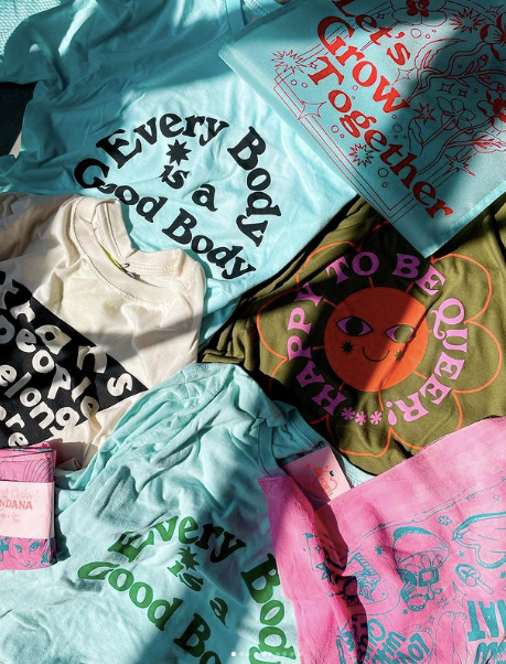
Ash + Chess (Ashley Molesso (she/her) and Chess Needham (he/him) is a stationery company based out of Richmond, VA. Most famous for its incredible lineup of greeting cards, the product assortment doesn't stop there. Ash & Chess deliver a retro, bold and heartwarming lineup of products that not only embody the love that the two have for each other (they are a real-life couple) but the true talent that the duo are as artists and activists.
It is our joy to introduce to you, Ash + Chess.
 What is the name of your company?
Ash + Chess
When was the company founded?
May 2017! We actually just hit our 5 year birthday this month. :)
Tell us the story of how you brought your company to life.
Ash: So we met on a dating app back in 2015 when we were both living in Brooklyn. I was working as a wallpaper designer and Chess, a high school special ed teacher. I took Chess to walk the National Stationery Show at the Javits Center in 2016 with the hopes of convincing him that we should try to start a business selling greeting cards. He was unamused, to say the least, but a year later, we found ourselves debuting our very own stationery company at that very same show... and it was a success!

How did you feel after it launched?
We had been cooking up designs and artwork on the side for about a year before we officially launched as a wholesale business, so when we finally had our first day at the trade show (NSS) and we actually made some sales, it felt like all that time, effort and planning we put into it was definitely worth it.
Where do you draw your design inspiration from?
We really love print, textile, and graphic design from the 60s and 70s, so we often look to old magazine ads and illustrators of that time. Design back then was just so fun and colorful and wild! We like to take those styles, make them our own and update them with topics and things that are relative to today's world.
Why was it important to you to create an “out and proud” LGBTQ+ company?
When we met, we were both still pretty new to being out and open with our queerness. I had been out for 3 years and Chess had just come out right before we met. While we both had known that we were queer way before either of us started living our truths, we still bonded very much over finding each other and being able to share this exciting thing with each other - being Gay AF and feeling strong enough to tell whoever didn't like it to Fuck Off.
When we started the company, we really wanted to put ourselves fully into it. We didn't want to be "safe" with our art, we didn't want to "please people" or be "polite" to the people who hate us. We wanted to be the people who made art for people like us. To make things that we wished we had seen out in shop windows or on people's walls or in classrooms as kids. We were so in love (and still are, hehe <3) when we started the business that it just seemed like the right idea to let people know that openly. Seeing places like Ladyfingers Letterpress so openly embracing their identities through their business made us think, that seeing queer people succeed and create spaces and different ways for other queer people to celebrate their identities is truly amazing. Why not contribute to cultivating queer joy ourselves through our art??? So when we debuted our company at NSS, we introduced ourselves as queer from the start.

Was there a defining moment in your company’s history (so far) when you knew you created something special?
I mean, honestly, for me, it was seeing Chess take our very first order from Patina in our booth. It was a GIANT order and we were kind of freaking out after he finished writing it. It was very reassuring to see people actually liking our products and designs enough to put them into their stores.
What has been the reaction of customers to your brand?
Everyone has been so supportive through the years and it truly is so heartwarming and special to meet people and hear their stories of how our art has impacted their lives. My favorite is when people email us and tell us their stories about how our art made them feel. We read every single one of them.
Any special customer stories that you want to share?
Alice from the L Word (Leisha Hailey) ordered cards from us once and we were literally freaking out over it. We put extra stickers in her package before mailing it and shortly after, her publicist emailed us with release forms to put our stickers on ALICE'S LAPTOP for season 2 of Gen Q!!! They do make a very brief appearance in one or two episodes but WOW that one I'll never forget!!!
At FRUITLOOTS, we call all the amazing products that we find our “loot”. What's a favorite piece of “loot” you have created?
I think that right now my favorite thing is our Queer Tarot deck that was just published this past April :').
Tell us about the FRUITLOOTS product that we have chosen.
The artwork for our Queer Tarot deck was printed on a Risograph, a really cool and clunky copier-looking machine that looks like it belongs in an office. The Riso prints one color at a time and has soy-based fluorescent, metallic, and regular inks! The models in all of the cards are real queer people, too. We did a couple of casting calls on Instagram at the start of the project and got over 500 entries!! It was so hard to choose people for the deck because everyone was so perfect and cute :') but in the end, we illustrated about 100 people total for the 78-card deck. And all of the cats and dogs featured in the decks are REAL pets of the participants too, including ours! From start to finish, the process of creating the deck was nearly 2 years. It was really wonderful to dive into, and we even worked with several people for it like Amber Berkins, our tarot-reading candle-making friend who helped us with the guidebook and all of the reverse meanings, and Alex Luciano who actually taught us everything we know about the risograph. This project has been our absolute favorite just because of the fact that we got to work with so many amazing people to make it a real thing. Including the community in the creation of this makes it that much more special.
Where do you see your company in 10 years?
We're hoping to have kids soon so we're looking forward to having another employee or two around ;) Haha! But really, in ten years, we hope to have our own building where we can have our office, fulfillment, screen printing and studio space, storefront, and most importantly a community space! From the beginning, we've always wanted to use our business to uplift queer people everywhere, so we're hoping to be able to create a space where people can come to and be around people like themselves.
If you could do a special collaboration with any person in the world who would it be and why?
This is hard!!! I mean, right now we are both fully obsessed with Our Flag Means Death (on HBOMax, PLEASE watch it), so like, I don't know, doing something with the genius minds behind the show?? Also fun fact, Jim is the Justice card in the Queer Tarot deck!!!!
Any advice to queer entrepreneurs?
Don't let people tell you to hide your truth!
Last question. If you could be any fruit, what would it be and why?
Ash: Pomegranate because at first they are confusing and weird and hard to eat and hard to understand, but once you figure it out, they're delicious and worth the effort!!! And I love the color of the juice :')
FOR MORE INFORMATION ON ASH + CHESS AND TO CHECK OUT THE REST OF THEIR COLLECTION, CLICK HERE
• • •
Leave a comment
This site is protected by hCaptcha and the hCaptcha Privacy Policy and Terms of Service apply.